Sunday 20 March 2011

Onomatopoeia

Quite a mouthful this word and a bit hard for me to pronounce correctly...

Onomatopoeia  An onomatopoeia is a type of word that sounds like the thing it is describing.


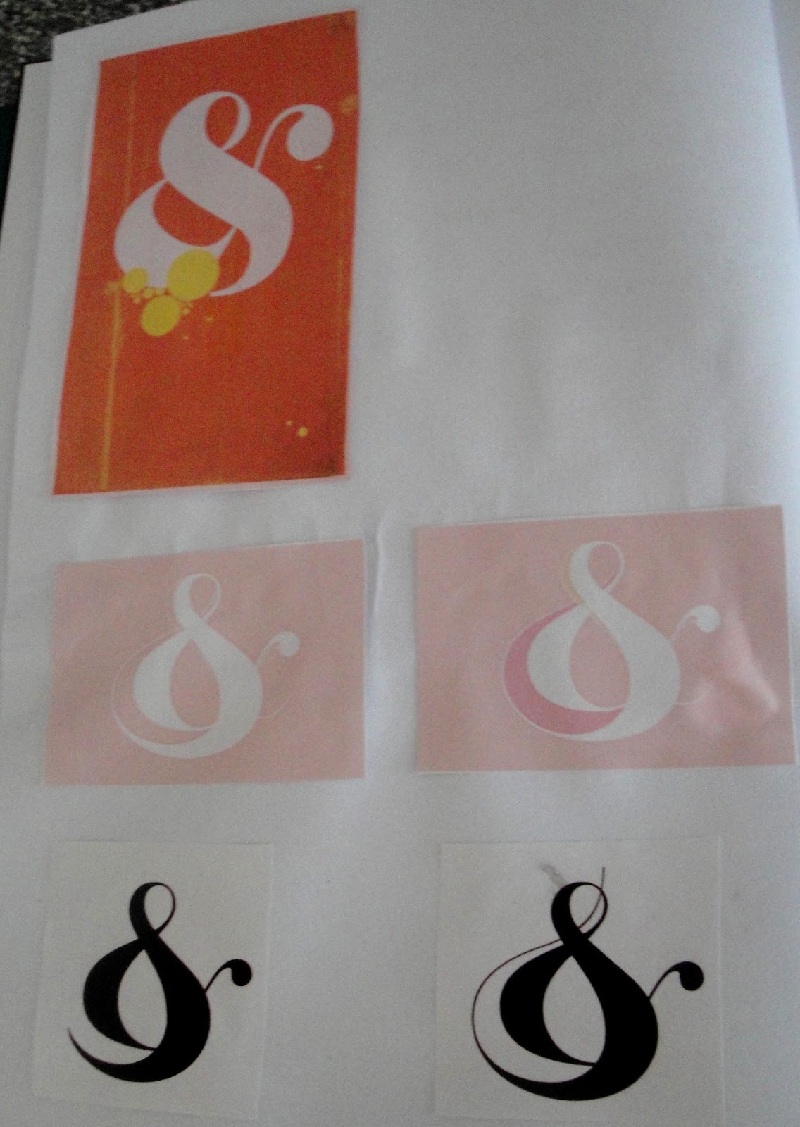
My first initial attempt was to make a book for children, here is the rough version.

Visual Examples


Pretty straightforward, "does what it says on the tin.."

I guess I pretty much know what I am doing for this word and want to stick to a book as I need some publishing work in my portfolio.  
I need however to find a way to make it interesting and fun as it will target young children.

Children books


My favourites


Thursday 17 March 2011

The Word as Image

Currently working on the A to Z project; I came across this (totally by chance I might add... ).


Close up of the picture above.
American - Carl Fernbach-Flarsheim "Mirror Field inside Random Field"
German - Ferdinand Kriwet "Poster"
 Russian - Valerian Neretchnikov "Tree from random letters"


Bodycopy

Visual Examples


Quite sweet, might have been worth see what it would like on transparent paper.

Close up of the picture below, hard to believe the woman is made of a multitude of strips of words pasted altogether. The result is truly amazing.  Here is more example of her work.


The body shaped text really "comes out alive" - for lack of finding a better descriptive expression!  However, I personally feel that the image of the woman sorts of spoils it... maybe it should have been another body shaped text or an illustration?

Nice to have the text follow the steam’s path.  The effect would have been greater if the illustration had been made of text.


I have come across some further examples in this book.

Wednesday 16 March 2011

The chosen ones...

As a result of my personal interests and taste within graphic design, I have decided to develop the following:

BODYCOPY:  
I wanted to portray bodycopy in a format other than in a publication.


I am not quite satisfied with the outcome.
The box doesn't really have any "purpose", the inside has the definition of "bodycopy" but it seems a bit boring.
Everything is flat looking lifeless.

Friday 5 November 2010

A to Z of Graphic Language - C

CMYK:  My initial idea is to take a picture and separate the colours to end up with a copy of Cyan, Magenta, Yellow and finally Black.

Just converted it into greyscale then saved each version as described above.

After feedback yesterday, suggesting to look at other ojects (which I will do) but my main concern is what do I do with this?

I have tried to print and copy each of them on transparent paper, which once all put on top of each other should give a different effect/ colour....
Unfortunately the transparent paper that I used did not hold the ink and it sort of "never quite dried"
I still would like to try this but first I need to find the right paper....

In the meantime I am thinking as a format,  a set of postcards (4) where the front would have the respective letter; cut out.


Saturday 30 October 2010

A to Z of Graphic Language - B

I have chosen Bodycopy for my second word.

"Main text found in publications we read.  Bodycopy is the text of the stories and articles.  It is usually between 8 and 14 points in size.  Readability is the key to selecting fonts for bodycopy."

So far I am thinking of using bodycopy of newspaper cuttings, which I would use in a context other than a publication i.e. booklet, magazine, spread etc...


Text is usually found just about everywhere; although on publicity items it is usually no more than a few words or a sentence as the message needs to be understood fast; which is why I thought it may be interesting to put large amount of text on a product not initially designed for this purpose.


Other 3D formats to consider: boxes. On the inside newspaper clippings.
The outside would have the definition of bodycopy.
On the lid, I want the letters BODYCOPY to have bodycopy inside them... I know how to do it with Photoshop...but that is too easy so I will try manually and compare both results.


The process to get there was quite lengthy... but each letter holds enough text to be "passed on" as bodycopy... now how about the computerised version?


This looks much cleaner (not to mention it can be achieved very quickly!) and I guess it looks at least as good as the handmade one...could definitely do with more text.
Now about mixing them up?


I think this one with some work would probably be better than the two above.  It is the handmade version scanned in; as it is now computerised, it offers some flexibility and potential.

Sunday 24 October 2010

Ampersand_Experimenting

Following some of the images online I have found; I have been experimenting with Mono Printing.
I will be doing a small square booklet; french fold - only a few pages - which will relate the experiments I have been undertaking to get to the final piece - last page.  I guess it is like the pdf we had to do for our very first project - but in a much simple, succinct way.


Gonna try and see if I could achieve a similar effect (top left) using Mono Printing.

Not quite what I was looking for - too dark and on the right I forgot one line.

Slightly better as there is less ink; the background needs to be reviewed on the right one.
The "scribbles" do not work.


Too light -  not enough ink. The right one is sort of all right although ultimately, I would love a background of a different colour.
Would it still be called Mono Printing?

This is more like I would like.  It is simply the top left picture put into Photoshop.  There are a few layers.  I want to be able to achieve this - I don't think it will matter too much if there are more than a colour but I want a this sort of background!